
Visual identity
We set out to create a visual identity that represents our association, our spirit, and our region!
So, for us, the best image is that of our chapel, which we have placed within its environmental context.
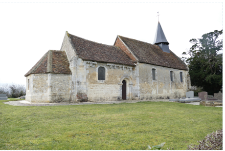
Photo HJLepetit
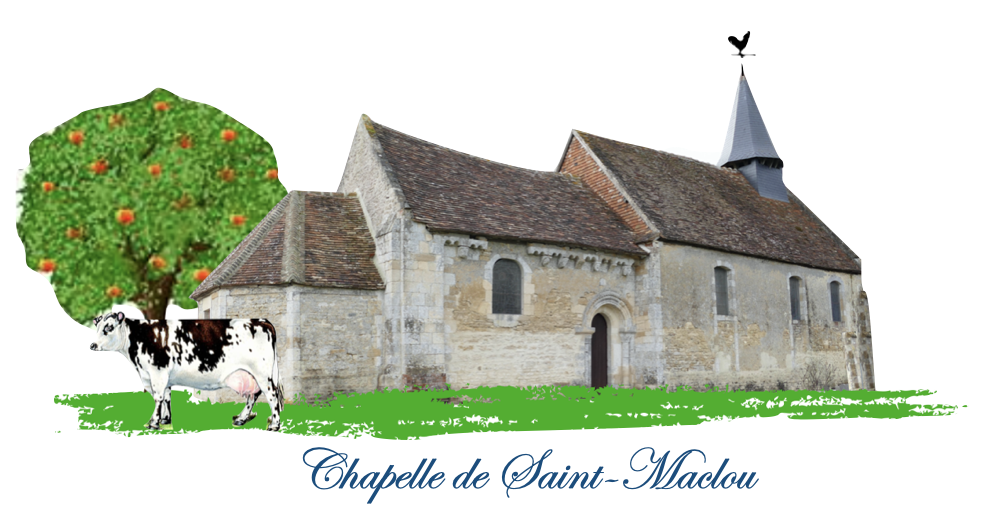
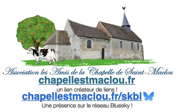
This logo is a reproduction of a cropped photo of the chapel.
To place the whole in its grassy and green setting, an apple tree and a cow add a touch of Norman cottage style.
The text “Chapelle de Saint-Maclou” is in Edwardian Script ITC font.
Signature
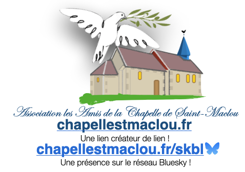
As a variation of the logo, we felt the need to also have a signature, which will be used in particular to initial emails.
In the graphic rework with flat colors, the chapel of Saint-Maclou is surmounted by a dove carrying an olive branch.
This image, with its symbolism, perfectly reflects our aspirations and the message we wish to convey.